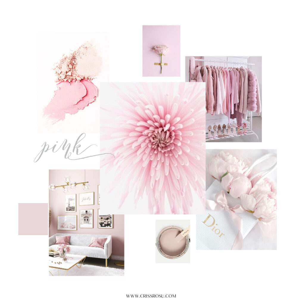
Pink’s colour psychology
June 27, 2022
Do you want to be a flamingo in a place full of grey pigeons? If the answer is yes, this article is made especially for you and your brand! Let’s talk about the pink’s colour psychology behind this joyful colour.

Pink’s colour psychology denotes a product or service geared at women.
That’s why pink is usually associated with feminine brands.
It all begins with pink being connected to newborn girls (while baby boys traditionally got blue). Pink is the main colour used to designate that toys and children’s clothing are meant for girls.
Pink is frequently used to rapidly imply that a product is intended for girls, from well-known brands like Barbie to in-store advertising and toy packaging.
Pink is a cheerful, youthful, and romantic colour. The representations of this highly charged colour range from subtlety and purity to opulence and elegance.
But be careful! It can range from being friendly and tender to coming across as cheap, cloying, too sweet, or even tacky.
We think it’s based more on the pink’s tint than its actual hue. In order to make things a bit simpler, I’ve divided the icon guide into three categories: light, bright, and dark pink.

Light Pink
Calm, childhood, cute, feminine, gentle, innocent, pretty, pure, refined, romantic, soft, soothing, sweet, sympathetic and upscale.
Bright Pink
Assertive, attention-getting, brave, energetic, fun, go-getter, happy, high spirits, passionate, playful, protective, shocking, tantalising, vibrant and youthful.
Dark Pink
Cautious, charming, contemplative, dramatic, elegant, exciting, grand, luxuriant, plush, regal, respectful, sophisticated, striking, warm and whimsical.

The importance of colour psychology in marketing
Pink is a well-liked colour that is often used to appeal to female audiences. The themes of femininity, unwavering love, fun, and immaturity are central to the colour pink. It is hardly unexpected that Victoria’s Secret and other beauty businesses make extensive use of this colour.
Victoria’s Secret employed a black and pink colour scheme on their website to draw attention to any marketing information. Additionally, their emblem and some lettering are pink.
If your brand’s identity is in line with the colour pink and your target market is primarily made up of women or girls, the latter could be a good option for your logo.
And also, if your business is a restaurant, salon or coffee shop, imagine how amazing your social media communication will be!

Pink branding colour schemes: combine and convince
Not every brand kit employs just one colour. Pink is a fantastic colour on its own, but pairing it with another hue can create new possibilities.
Similar to how different pink hues evoke various feelings, so do different colour schemes. Let’s investigate the most well-known ones and determine their meanings.
Pink and Black
In a business logo, using black and pink together is a terrific approach to create a sophisticated yet playful striking design.

White and Pink
White’s impartiality highlights pink’s lively and joyful qualities. It makes a lively, joyful, and inspiring impression whether the logo is pink on a white backdrop or white on a pink background.

Blue and Pink
The pairing of pink and blue is another intriguing one. The associations that the two hues evoke are very dissimilar from one another. Pink incorporates pleasure, sweetness, and originality into the design while blue in logos stands for excellence, dependability, and trust.

Orange and Pink
Combining vivid orange and luscious pink has a really energising effect. When viewed separately, the hues are striking and intense. The impact doubles when two objects are put next to one another.

Let’s talk and see what is the perfect combination for you and your brand!
In conclusion…
To sum up, a pink logo can be used in a number of different industries. Among them are entertainment, confectioneries, cosmetics, fashion, children’s toys, as well as services with a fun and playful edge.
If your brand is addressed to girls and women, pink is a great colour to consider in building your brand!
Leave a Reply Cancel reply
"Where creativity meets love your brand blossoms into a beautiful story"
Follow me
Terms & Conditions