The Marketing Psychology of Colours
June 10, 2022
Colour is an important tool since it influences how we think and act. Our eyes are directed by colour to where they should look, what they should do, and how they should interpret something. Let’s find out more about the marketing psychology of colours.
It contextualises information. It assists us in determining what is significant and what is not. That’s why, as a boss babe and business owner, you need to know what colour signify to different people. Let’s take some examples, shall we?





RED
Commonly seen: Stop lights, Valentine’s Day, and horror films.
Red is a vibrant, powerful colour that expresses our physical demands, whether it’s to express affection and love or to convey panic, fear, and survival.
ORANGE
Commonly seen: Fruits, sporting events, and board games.
Orange has an intriguing psychological meaning because it blends the power and intensity of red with the warmth and pleasure of yellow. Orange is a good picture of physical comfort in our warmth, food, and shelter because of the combination.
YELLOW
Commonly seen: Traffic crossings and signs, smiley faces, and window-front displays.
Yellow represents joy, happiness, cheerfulness, optimism, and so on. Yellow is usually typically associated with happiness. Yellow has a relatively long wavelength, making it one of the most potent psychological meanings while simultaneously being the most visible colour.
GREEN
Commonly seen: Nature, economic exchange, health-based stores, and restaurants.
Green is the colour of harmony and balance. Green combines a balance of both the logical and emotive, giving us a clearer feeling of right and wrong. Green is a common colour in nature, and it represents vitality, leisure, and tranquillity. It’s also a symbol of progress, whether it’s in the form of a physical object like a plant or in our financial situation.
BLUE
Commonly seen: Workout facilities, hospitals, and spas.
Blue is noted for its dependability and trustworthiness. It’s dependable, trustworthy, and also mentally relaxing. Meanwhile, it’s one of the most popular colours in the world for that reason alone.
PURPLE
Commonly seen: Magic shows, fairy tales, and luxury products.
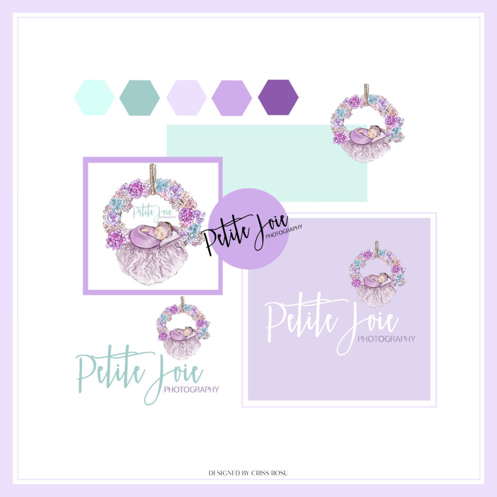
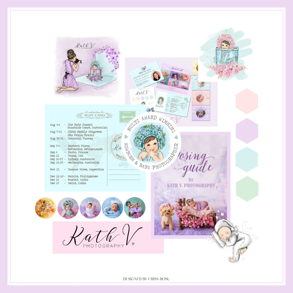
Purple is most renowned for its mysticism and inventiveness. It combines the vitality and force of red with the stability and dependability of blue, certainly creating the ideal physical-spiritual balance. Purple is frequently associated with wealth, loyalty, bravery, mystery, and enchantment.
PINK
Commonly seen: Cancer patients, feminine, little kid objects, and bathroom products.
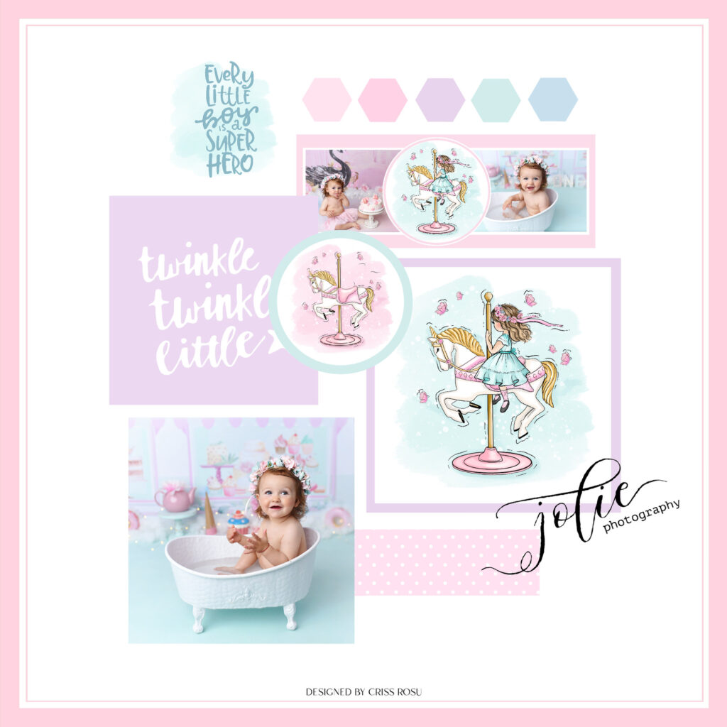
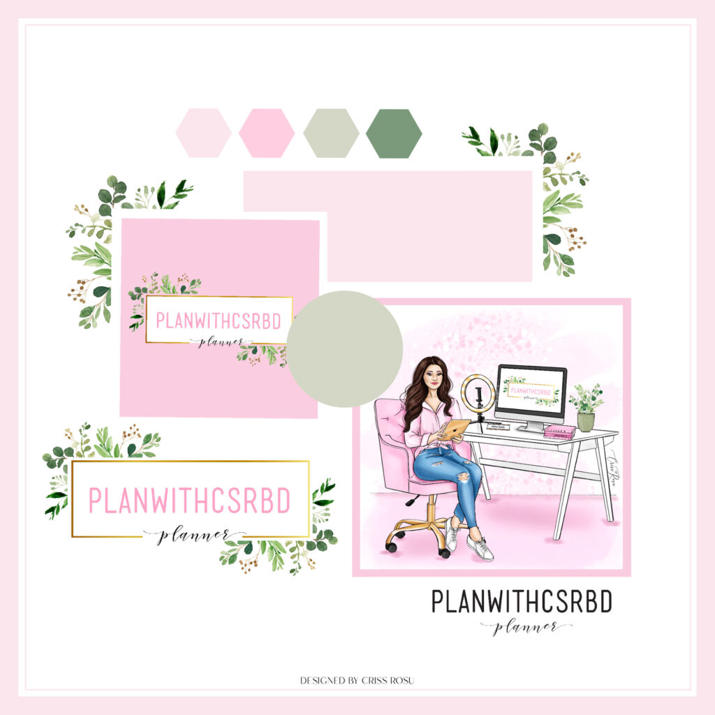
Pink is a softer, less powerful form of red that evokes feelings of love and compassion. It’s a very physical colour, yet it calms rather than stimulates, making it ideal for caring for, understanding, and nurturing individuals who are in need.
BLACK
Commonly seen: Professional attire, luxury products, and limos.
The colour black represents refinement, seriousness, control, and also independence. It can, however, be used to depict evil, mystery, despair, or even death. Black is a highly restrained hue that has no light because it is the absence of all colours. It prefers to remain hidden, in command, and apart from others.
WHITE
Commonly seen: Weddings, website backgrounds, and doctor’s waiting rooms.
White is a fantastic example of purity, innocence, cleanliness, and tranquillity since it is a colour that is complete and pure. White can also symbolise new beginnings, as it represents a clean slate and provides inspiration for new ideas.
What colour is best for your brand? Let’s talk about it and find the perfect combination for your brand’s style and customers!

Leave a Reply Cancel reply
"Where creativity meets love your brand blossoms into a beautiful story"
Follow me
Terms & Conditions