Brand Colours: what are they, how to choose and how to use them
June 10, 2022
We all want to see the world in colours. Bright-sparkly-cool colours that gives us joy, or reminds us of the environment, or makes us hungry- yes, colours can do that. And that’s why it is very important what colour you choose for your brand. Define your brand colours and make it stand out!
Let’s dive in for more information about what these colours are, how to choose them and how to use them.
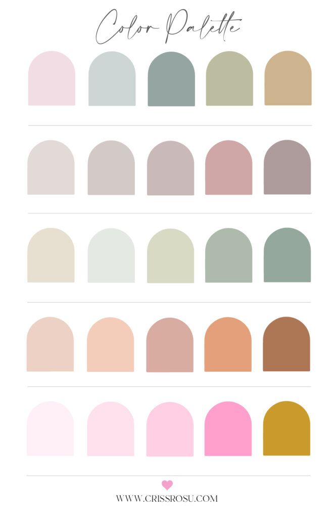
What Do Brand Colours Mean?
The “brand colours” are an important part of a company’s visual identity. Typically, 3-8 colours are chosen to create a colour palette that compliments the brand’s personality and style.
Primary and secondary brand colours are the two categories of brand colours, for example:
The major, constant colours used in all graphics, publications, signage, and other materials are known as primary brand colours. Because primary brand colours are so important to the business’s visual identity, they rarely change.
The logo and the primary colour of your brand are intrinsically linked. Coca-Cola is a wonderful illustration of this. What colour came to mind when I said Coca-Cola?
You probably thought of red. The Coca-Cola Company’s principal brand colour is red, which is used regularly and frequently in all marketing.
The secondary colours are used to complement the major brand colours. These colours are changed more regularly to suit strategy trends and marketing objectives.
If you want to appeal to a younger market, for example, you may change your secondary colour palette to reflect current colour trends that appeal to that demographic.
The secondary these colours can be utilised on your website, social media, and packaging, but they should not make up more than half of the entire design.
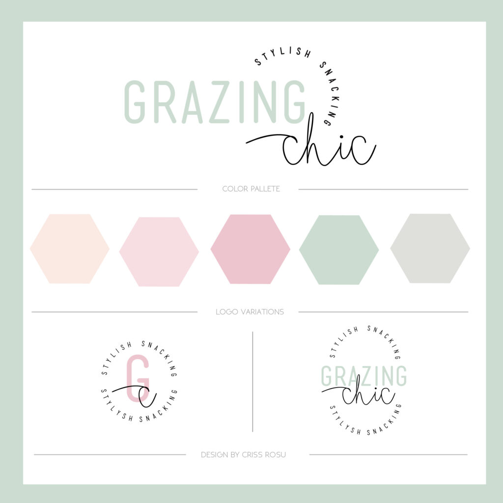


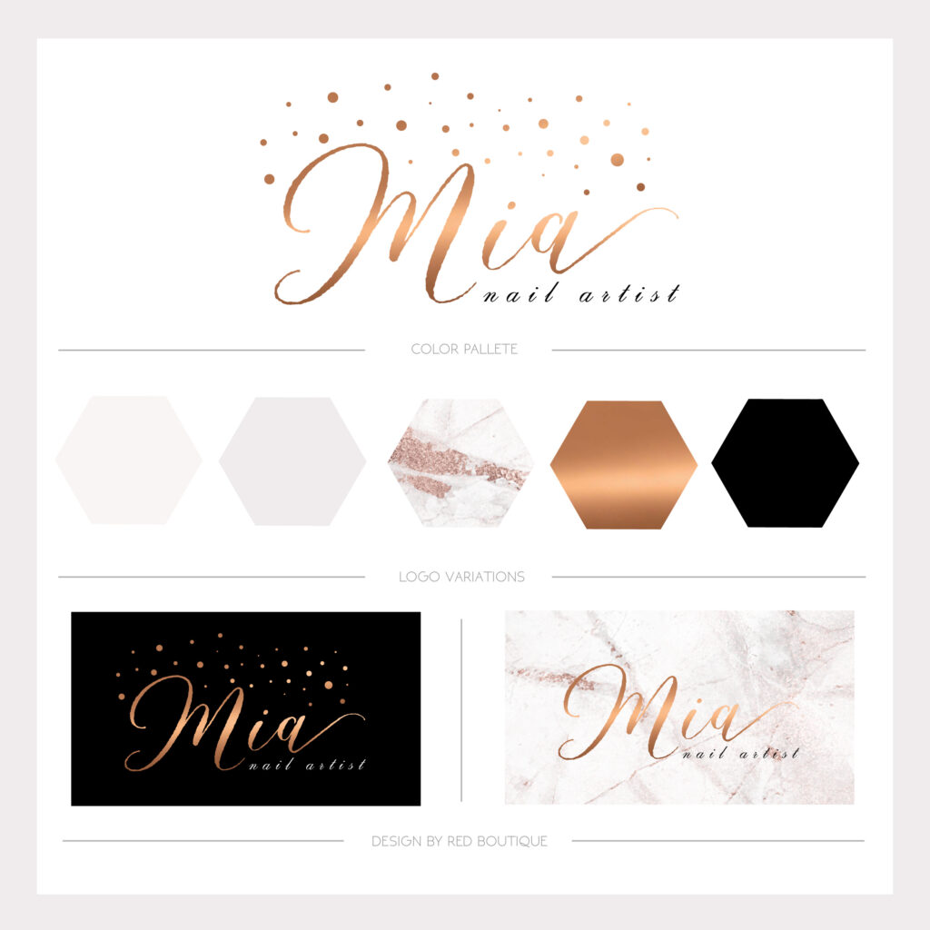
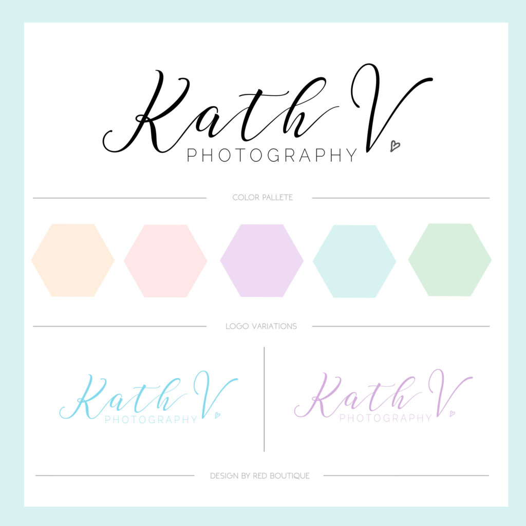

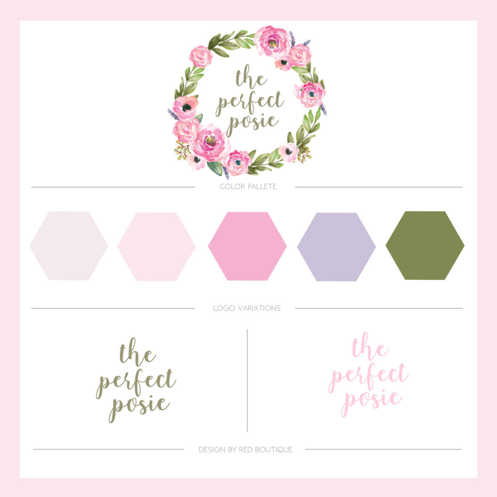
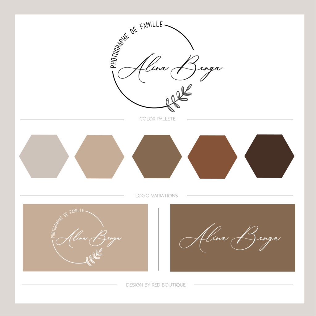
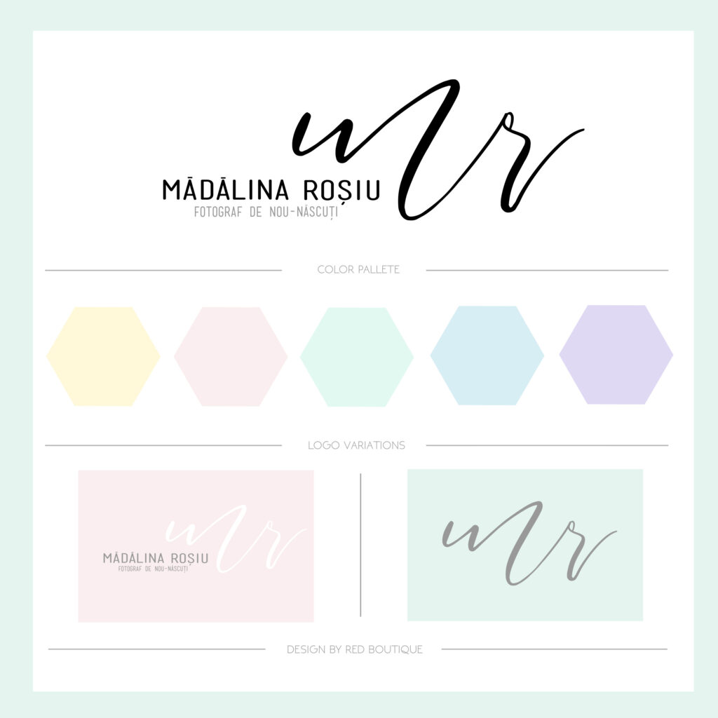
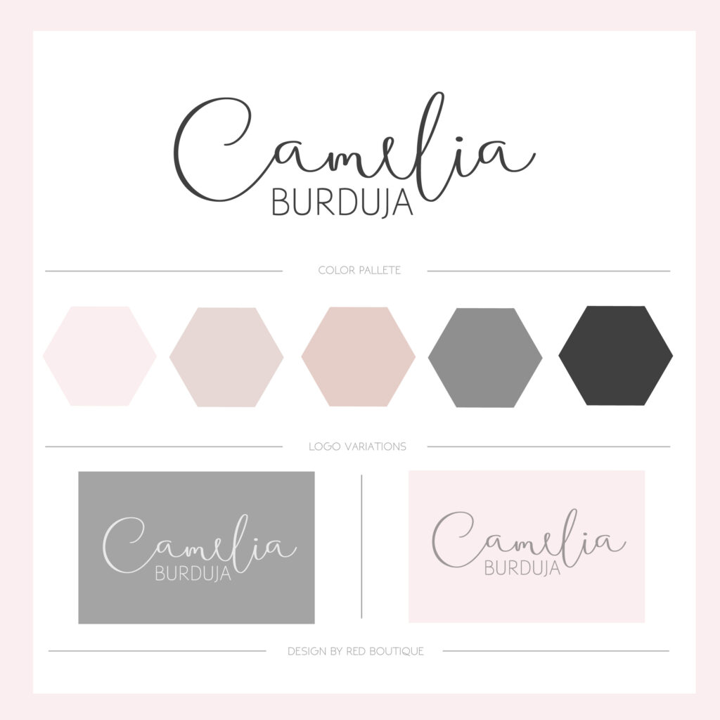
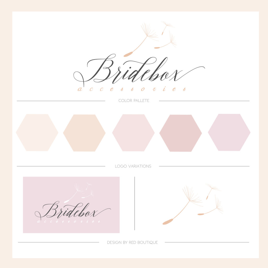

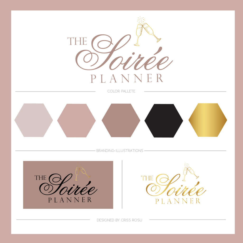

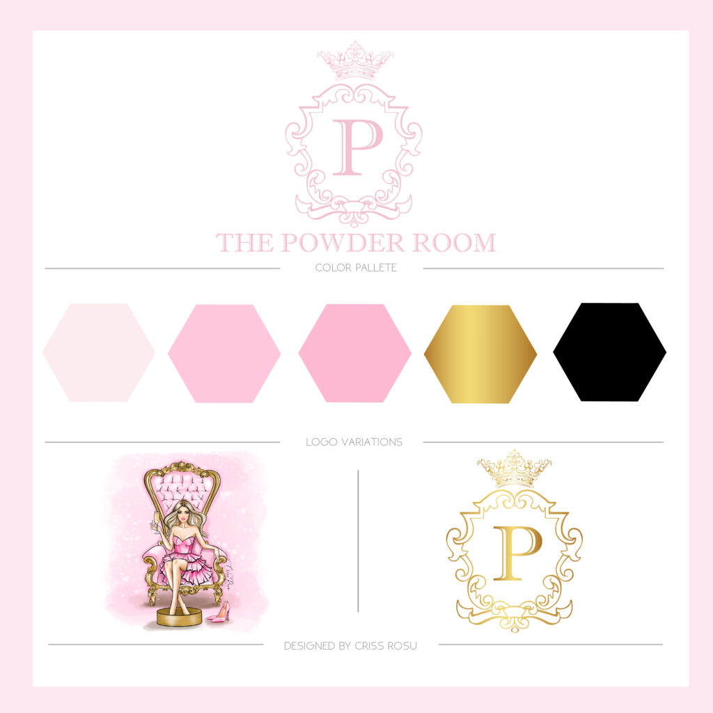
How do you choose & use the brand colours? Here are some quick guidelines:
- Choose up to three primary brand colours.
- Choose up to five secondary colours for your brand.
- Choose colours that reflect your company’s personality and style.
- Choose colours that are versatile and long-lasting.
- Decide on a colour scheme for your company
- Colours should not be changed frequently.
EXTRA: here is a tool that can help you find if a colour matches with others – Adobe Colour Wheel.

Leave a Reply Cancel reply
"Where creativity meets love your brand blossoms into a beautiful story"
Follow me
Terms & Conditions