Font Psychology: how do we choose typography in Branding
May 24, 2022
Now that we have been talking about colours, let’s see how the fonts can help us obtain what we want for a brand- to connect more quickly with our clients and potential clients. Are you ready to be blown away by the font psychology?
To comprehend font psychology, let’s talk about a font’s primary qualities and what they represent.
Simple vs. Complex: Simple typefaces are direct and allow the viewer to create an association more quickly. This might make your logo easily identifiable. Looking for something more distinctive and unique to set your logo apart from the competition? The use of a sophisticated font is recommended.
Lowercase letters express love and care better than uppercase letters. Uppercase fonts, on the other hand, portray energy, focus, power, and strength.
Lightweight or thin fonts are frequently linked with femininity, gentleness, and beauty. Bold fonts, on the other hand, are associated with masculinity, power, and confidence.
Rounded vs. Angular: Rounded and light fonts convey tenderness and femininity, as well as a sense of support or comprehension. Angular fonts are considered more manly since they are seen as strict or direct.
Short vs. tall fonts mess with our perception of the earth’s gravity. Short typefaces appear to represent stability and steadfastness, whereas large letters appear to convey elegance and richness.
Slanted vs. Straight: Slanted fonts have the appearance of “going forward,” giving them a sense of movement. Fonts that are “up-and-down” appear more stiff and stable than those that are slanted.

Now that we have a little clarity about the font’s specificities, let’s see what types of fonts are the most popular:
SERIF FONTS
Serif fonts are the go-to fonts for brands who want to adopt a formal tone in their design. They began in the 15th century and are known as a traditional typeface. Times New Roman, Baskerville, and EB Garamond are examples of serif font styles.
Because of the slight flick at the top and bottom of the letters, they’re called serif fonts. It’s a popular choice for businesses looking to project a professional image. Serif fonts can evoke feelings of trust, superiority, and formality.
Editorial periodicals, financial organisations, jewellery lines, law companies, and colleges all utilise serif fonts.
SANS SERIF FONTS
Sans serif fonts are the greatest choice if you’re looking for a minimalist or tech-savvy font. Sans serif typefaces, unlike serif fonts, lack supplementary elements. Its clear and understandable appearance makes it a popular choice for businesses that wish to project a modern, inventive, and trustworthy image.
Open Sans, Lato, Arial, and Helvetica are examples of sans serif typefaces. Sans serif typefaces are commonly used by major organisations such as Netflix, Google, and Spotify.
SLAB SERIF FONTS
Slab serif fonts are comparable to serif fonts, but they’re bolder, bigger, and more blocky. These typefaces are commonly employed in headlines, ads, book covers, posters, and logos to convey heavy or dramatic tones.
Sony, Volvo, and Honda, for example.
SCRIPT FONTS
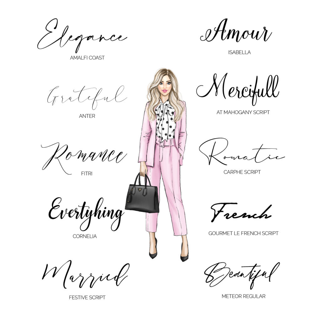
Script fonts, unlike serif fonts, bring more flair and detail to your design. They’re made to look like a person’s handwriting to add a personal touch to the design. If applied correctly, it can make your article more lively and joyous or beautiful and conventional, depending on the tone you want to achieve.
Coca-Cola, Kellogg’s, Barbie, and Pinterest are all known for using script typefaces.
HANDWRITTEN FONTS
Handwritten fonts are a good option if you’re looking for something more casual. If you want to go for an unconventional style for your company, they’re a fun alternative to classic serif fonts. It raises the bar on both eccentricity and sophistication.
Logos, social media postings or banners, t-shirt designs, and book covers are all typical uses for handwritten typefaces.
Amatic SC, Shoreline, and Permanent Marker are examples of handwritten fonts.
MODERN FONTS
Modern typefaces, such as sans-serif fonts (which can also be serif fonts), are used to convey power, development, and individuality. They’re frequently fashionable and have a wide range of characteristics.
They can be strong or graceful, with a mix of thick and thin strokes, but they all have one thing in common: they are read as cutting-edge and have a certain flair that appeals to a modern audience.
These fonts are frequently seen in logos from digital companies and streaming services to mainstream fashion brands by a modern audience.
Here are a few instances of brands that have benefited from using a modern font- Hulu, Pepsi, Twitter, IKEA
DISPLAY FONTS
Display fonts are used when a simple font isn’t enough. Display fonts are designed to attract the audience’s attention and often employ unique and loud characteristics to accomplish so.
These are the most exciting and distinctive typefaces to design with, as they were made entirely by the creator in some situations. When using premade fonts, they are frequently “twisted and contorted to give the logo any desired meaning.”
Display fonts are used by brands who want to be recognized and are not afraid to stand out.
Toy manufacturers, fast-food restaurants, and the entertainment business all utilise these fonts – examples: LEGO, Disney, Kool-Aid, Subway.
Ok, I know all this information is new and you may feel a little confused about what is the right voice for you, but the good news is I am the font guru when it comes to branding and I want to help you choose the right one for your brand.
Let’s talk about typography, boss babe!
Leave a Reply Cancel reply
"Where creativity meets love your brand blooms into a beautiful story"
Follow me
Terms & Conditions